23°
Cannabis
The challenge
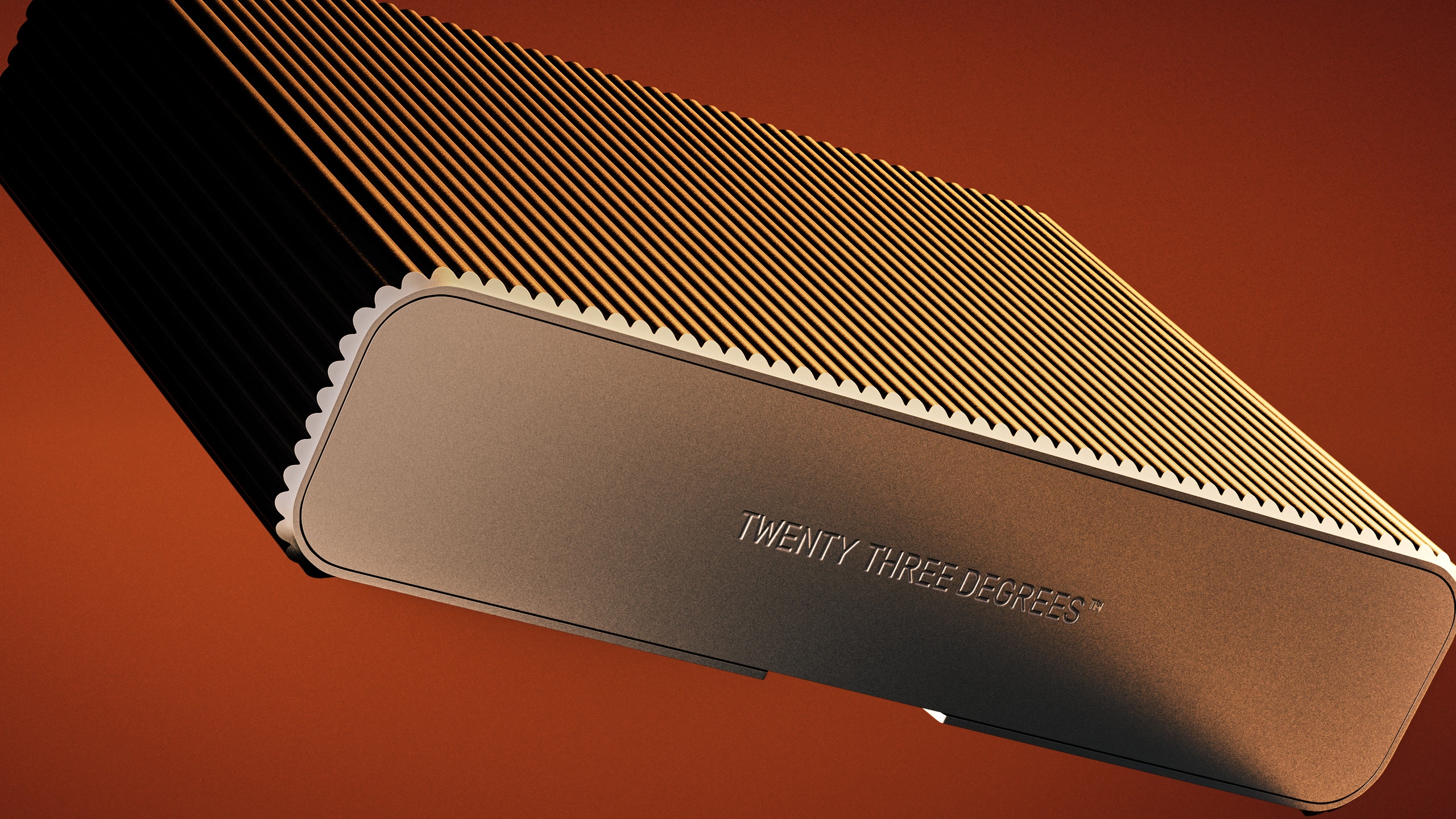
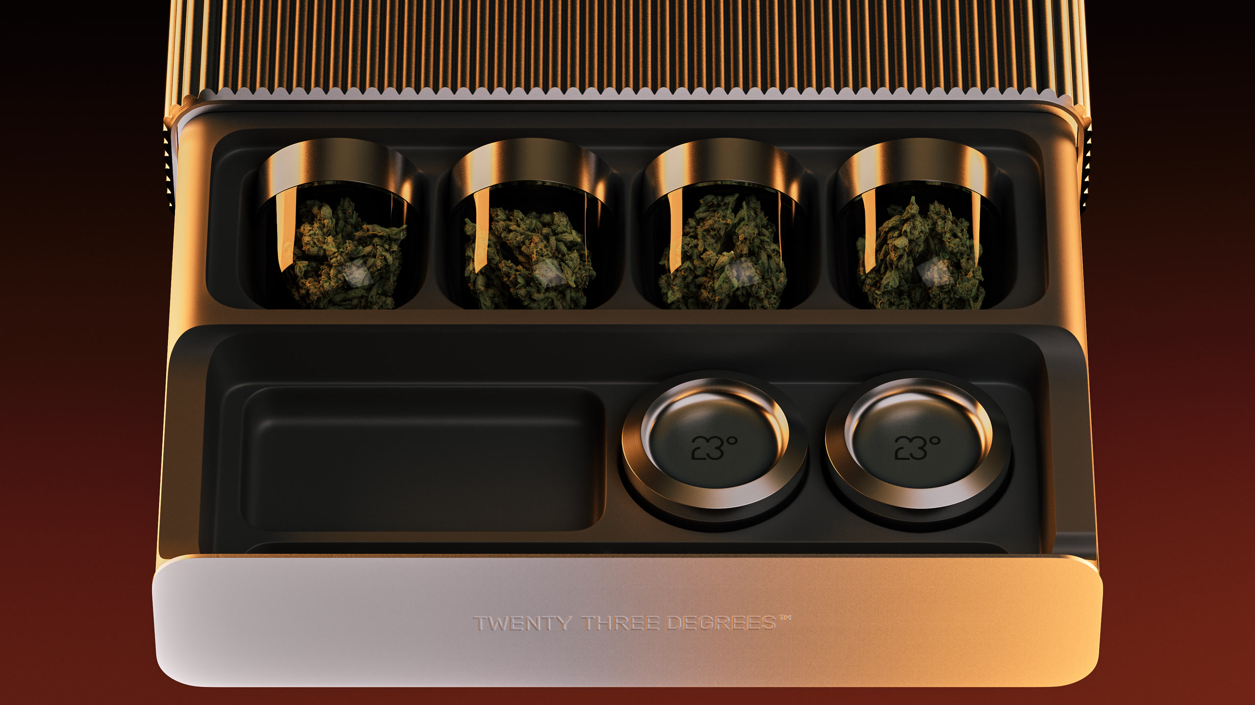
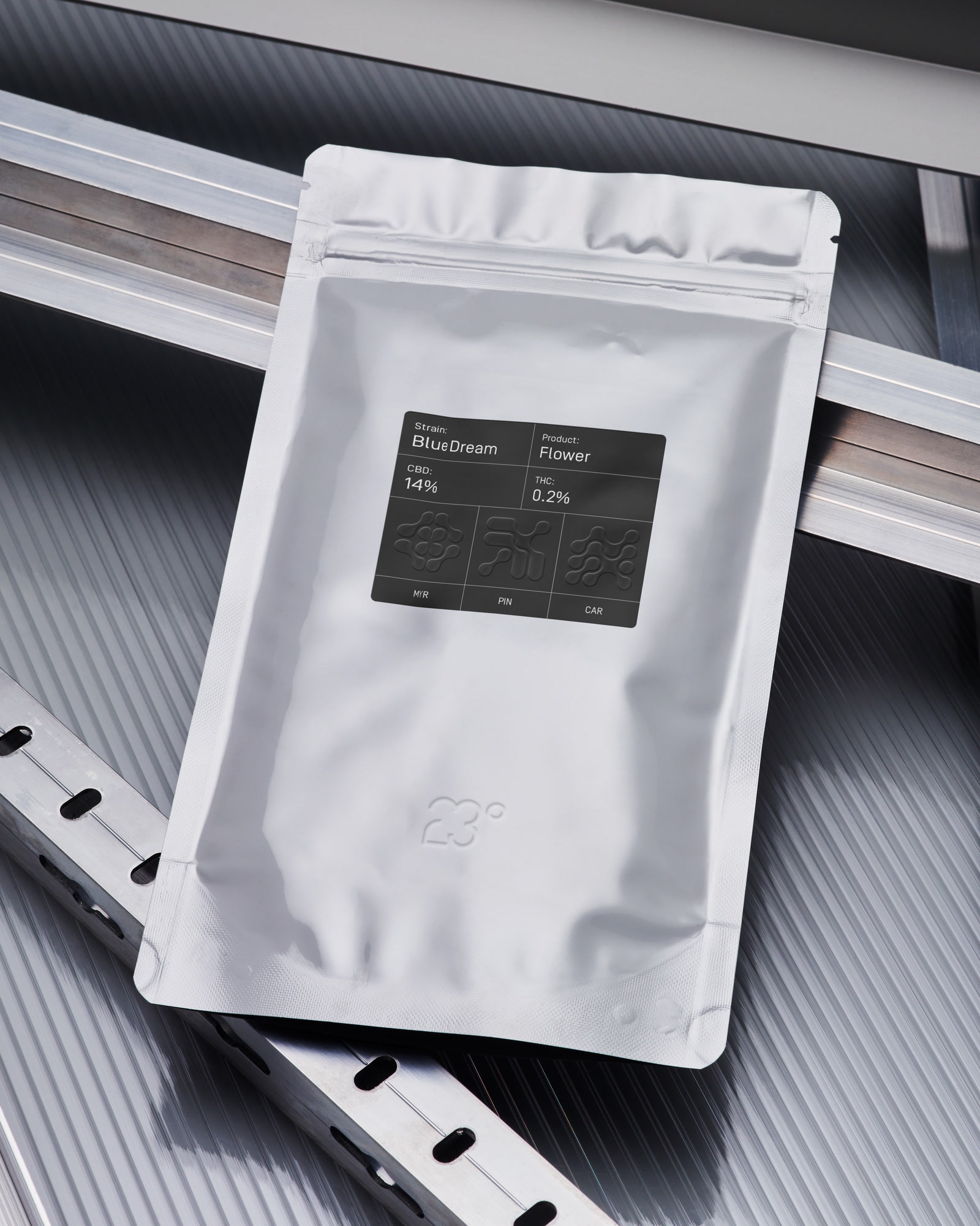
23° was bringing precision tools and carefully considered CBD flower to a category still shaped by old cannabis stereotypes. It needed a brand that reflected the care behind its products and helped customers understand what makes a better smoking experience.


The idea
We built the brand around the idea that how you smoke matters as much as what you smoke. That meant making the science useful: helping people understand the plant, its flavours and the role of preparation and storage. Knowledge became a reason to choose 23° and a way to get more from the ritual.


In closing
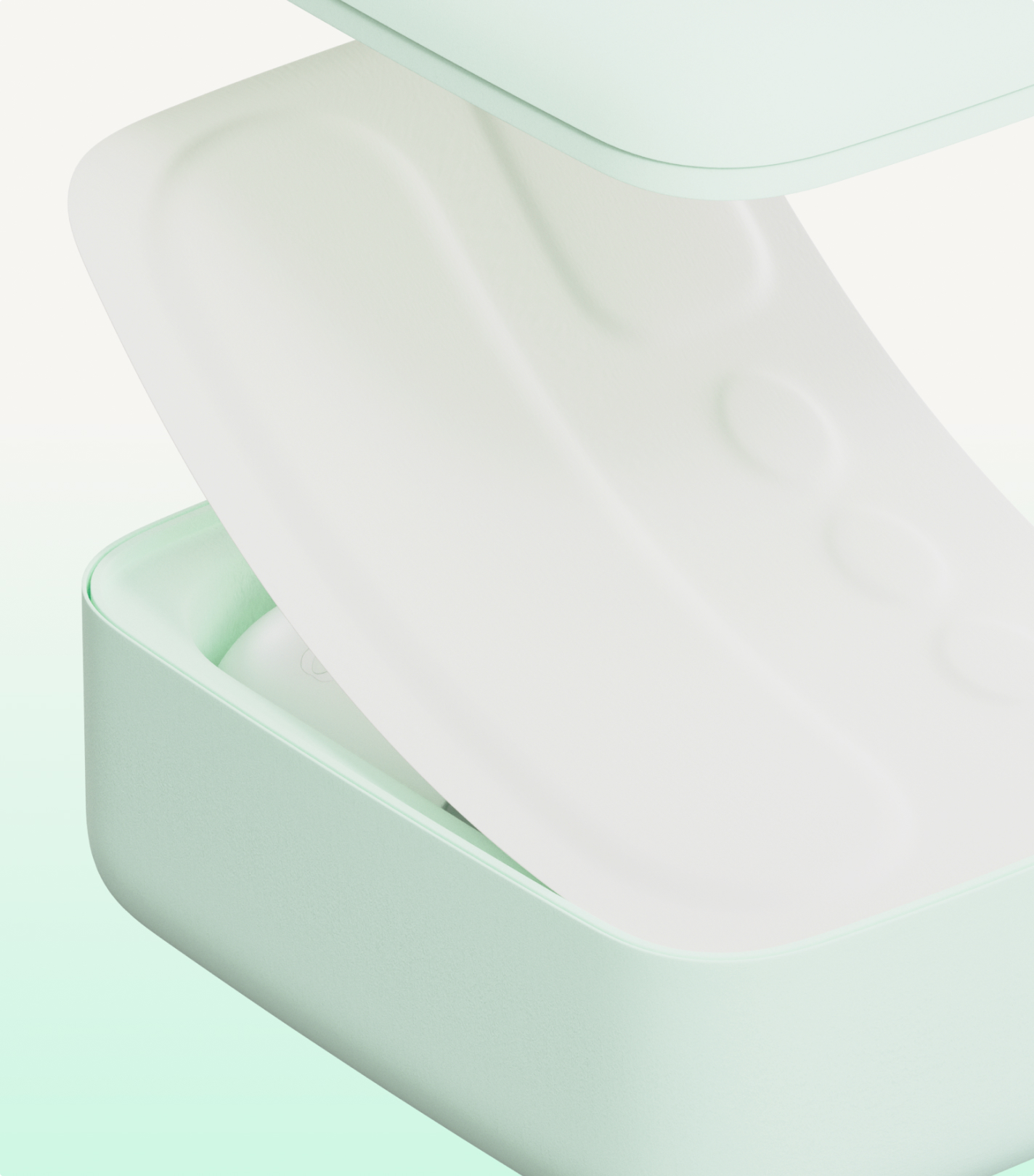
A visual identity and packaging system drawn from the anatomy of the cannabis plant. A circular grid shaped the logo and a series of graphics representing each strain’s terpene profile. Precise typography and a black-and-white palette gave the range a consistent character, with education built into the way people discover and choose each product.
Credits
Mitch Capurso, Christian Gyde
Mitch Capurso, Christian Gyde
Mitch Capurso, Molly Woof
Mômes Studio (Marco Ruegg)